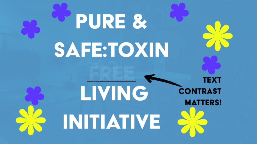
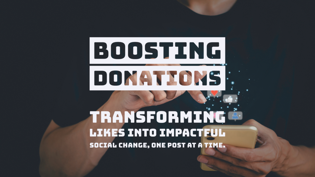
Text contrast is a vital aspect of website accessibility, especially for purpose-driven organizations that strive to make a positive impact on their communities. Ensuring that everyone, including users with visual impairments, can comfortably read and interact with your content is a powerful way to embody inclusivity. By focusing on accessibility, your non-profit or socially responsible organization can ensure that your message reaches all audiences effectively, without barriers.
Text contrast refers to how much text stands out from its background. A higher contrast makes reading easier, especially for individuals with low vision or color blindness. Without sufficient contrast, accessing crucial information becomes challenging for many users, which could prevent them from engaging with the services or support your organization provides.
The Web Content Accessibility Guidelines (WCAG) set the standard for accessible text contrast. They recommend a contrast ratio of at least 4.5:1 for regular text and 3:1 for larger text. Meeting these standards not only makes your website more inclusive but also enhances the overall user experience for everyone—allowing your mission and values to connect with the widest possible audience.
Tips for Optimizing Text Contrast
- Use High Contrast Colors: Pair dark text with light backgrounds or vice versa to create strong visual distinction. This helps ensure that all users, regardless of visual ability, can access your content.
- Test Contrast Ratios: Utilize tools like the WebAIM Contrast Checker to evaluate your site’s text contrast and ensure it meets accessibility standards. This small step can significantly boost the inclusivity of your site.
- Don’t Rely on Color Alone: Some users have difficulty distinguishing between colors. To avoid confusion, use additional cues like underlines for links to make sure meaning is clear. This ensures that important calls to action, like donation buttons or sign-up links, are accessible to everyone.
Improving text contrast makes your website more accessible and easier to navigate for all users—including those with disabilities—helping everyone fully engage with your content and mission. By optimizing accessibility, your organization can build a more inclusive community and ensure that no one is left behind.
References
- World Wide Web Consortium (W3C). (n.d.). Web Content Accessibility Guidelines (WCAG) 2.1. Retrieved from https://www.w3.org/TR/WCAG21/
- WebAIM. (n.d.). Contrast Checker. Retrieved from https://webaim.org/resources/contrastchecker/


